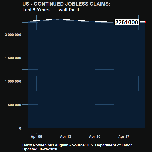
US Unemployment
R Code: Made using RStudio
DataViz can take a complex problem and help visualize it. Using R I pulled from the Federal Reserve API the data I needed to make this chart.
The code below was the result of lots of playing around and I reused it for a few things, so needs some cleaning up, but otherwise is a good example of how to use R to take a bunch of meaningless numbers, and visualize them in a way that is useful to the average person.
  #################################################
  # set libraries ----
  library(fredr)
  library(zoo)
  library(tidyverse)
  library(lubridate)
  library(gganimate)

  library(ggrepel)
  library(dplyr)

  library(readr)
  library(ggplot2)
  library(scales)
  library(png)
  ################################################

  fredr_set_key("3836dca1e0e84375cdba67b4853fa040")
  # replace YOUR_KEY with the key FRED gives you

  #################################################
  # get and wrangle data

  # Seasonally adjusted weekly claims
  CCSA<-
    fredr(
      series_id = "CCSA",
      observation_start = as.Date("2015-04-04")
    )

  # CCSA<-
  #   fredr(
  #     series_id = "CCSA",
  #     observation_start = as.Date("1967-01-07")
  #   )

  # Non seasonally adjusted weekly claims
  ICNSA<-
    fredr(
      series_id = "ICNSA",
      observation_start = as.Date("2015-04-04")
    )

  # Monthly US Labor Force (Seasonally Adjusted)
  CLF16OV <-
    fredr(
      series_id = "CLF16OV",
      observation_start = as.Date("2015-04-04")
    )


  # Monthly Nonfarm Payroll employment (seasonally adjusted)
  # used later
  PAYEMS<-
    fredr(
      series_id = "PAYEMS",
      observation_start = as.Date("2015-04-04")
    )

  # wrangle data ----

  df <-
    left_join(ICNSA %>% pivot_wider(names_from=series_id,values_from=value),
              CCSA %>% pivot_wider(names_from=series_id,values_from=value),
              by="date") %>%
    mutate(year=year(date),month=month(date))

  df2 <-
    data.frame(CLF16OV %>% pivot_wider(names_from=series_id,values_from=value)) %>%
    mutate(year=year(date),month=month(date)) %>%
    select(-date)

  # merge monthly labor force stats with weekly claims data by year and month
  # we could refine the interpolation, but it won't matter for the big picture

  df3 <-
    left_join(df, df2, by=c("year","month")) %>%
    mutate(ind=row_number(),
           ratioSA=CCSA/CLF16OV/1000,
           ratioNSA= round(ICNSA/CLF16OV/1000,digits=4) ) %>%

    # add some dramatic pauses for the animation in the last 4 weeks
    mutate(ind=ifelse(date=="2020-03-21", ind+100,ind)) %>%
    mutate(ind=ifelse(date=="2020-03-28", ind+400,ind)) %>%
    mutate(ind=ifelse(date=="2020-04-04", ind+700,ind)) %>%
    mutate(ind=ifelse(date=="2020-04-11", ind+900,ind)) %>%
    mutate(ind=ifelse(date=="2020-04-18", ind+1100,ind)) %>%
    mutate(ind=ifelse(date=="2020-04-25", ind+1300,ind)) %>%
    #mutate(ind=ifelse(date=="2020-04-11", ind+700,ind))
    # mutate(ind=ifelse(date==max(date),ind+2500,ind)) %>%


    mutate(ratioSA=ifelse(date=="2020-04-04", 0.0431,ratioSA)) %>%
    mutate(CLF16OV=ifelse(date=="2020-04-04", 	162913,	CLF16OV)) %>%
    mutate(ratioNSA=ifelse(date=="2020-04-04", 0.0372,ratioNSA)) %>%

    mutate(ratioSA=ifelse(date=="2020-04-11", 0.0372,ratioSA)) %>%
    mutate(CLF16OV=ifelse(date=="2020-04-11", 	162913,	CLF16OV)) %>%
 #   mutate(CCSA=ifelse(date=="2020-04-11", 11976000,CCSA)) %>%

  mutate(ratioSA=ifelse(date=="2020-04-18", 0.0372,ratioSA)) %>%
    mutate(CLF16OV=ifelse(date=="2020-04-18", 	162913,	CLF16OV)) %>%
#    mutate(CCSA=ifelse(date=="2020-04-18", 14976000,CCSA)) %>%

  mutate(ratioSA=ifelse(date=="2020-04-25", 0.0372,ratioSA)) %>%
    mutate(CLF16OV=ifelse(date=="2020-04-25", 	162913,	CLF16OV)) %>%
    mutate(CCSA=ifelse(date=="2020-04-25", 19976000,CCSA))

  #  mutate(ind=ifelse(date==max(date),ind+2500,ind))


  # a <-
  #   ggplot(data=df3, aes(x=date,y=CCSA/1000))+geom_line()+
  #   view_follow()+
  #   geom_point(color="red")+
  #   transition_reveal(ind)+
  #   theme_minimal()+
  #   theme(plot.caption=element_text(hjust=0))+
  #   labs(x="",y="",title="Initial Jobless Claims (thousands, seasonally adjusted)",
  #        caption="Harry Royden McLaughlin - Coded in R - Source: U.S. Department of Labor")
  #
  # animate(a,end_pause=25, nframes=350,fps=12)
  # save_animation(last_animation(), file="C:\\Users\\harry\\OneDrive\\Desktop")
  #
  # a2 <-
  #   ggplot(data=df3, aes(x=date,y=ICNSA/1000))+geom_line()+
  #   view_follow()+
  #   geom_point(color="red")+
  #   transition_reveal(ind)+
  #   theme_minimal()+
  #   theme(plot.caption=element_text(hjust=0))+
  #   labs(x="",y="",title="Initial Jobless Claims (thousands, not seasonally adjusted)",
  #        caption="Harry Royden McLaughlin - Source: U.S. Department of Labor")
  #
  #
  # animate(a2,end_pause=25, nframes=350,fps=12)
  # save_animation(last_animation(), file="C:\\Users\\harry\\OneDrive\\Desktop")


  a3 <-
  #  ggplot(data=df3, aes(x=date,y=CCSA,label = round(CCSA) ))+
    ggplot(data=df3, aes(x=date,y=CCSA,label = as.factor(CCSA) ))+
    geom_line()+
    view_follow()+
    geom_point(color="red", size = 4)+
    geom_line(size = 2, colour="#FFFFFF") +
    geom_area(color="#062749", fill="#062749", alpha = 0.6)+


    geom_label_repel(segment.colour = "black",
                     fontface = 'bold',
                     box.padding = unit(0.5, "lines"),
                     point.padding = unit(1, "lines"),
                     segment.color = "Red",
                     size = 8

    ) +


    scale_y_continuous( labels = scales::number_format() )+
  #  scale_y_continuous(labels=scales::percent)+
    transition_reveal(ind)+
    theme_gray()+
    theme(plot.caption=element_text(hjust=0))+

    theme(plot.title = element_text(color = "lightgray", size = 20, face = "bold"))+
    theme(plot.subtitle = element_text(color = "white", size = 18, face = "bold"))+
    theme(plot.caption = element_text(color = "white", size = 15, face = "bold"))+

    theme(panel.background = element_rect(fill = "#0f1010", colour = "#0f1010", size=4))+

    theme(plot.background = element_rect(fill = "#0f1010",colour = NA))+


    theme(panel.grid.major = element_line(colour = "#537e9d", linetype = "dotted"))+
    theme(panel.grid.minor = element_line(colour = "#537e9d", linetype = "dotted"))+

    theme(axis.text.x = element_text(face="bold", color="lightgray", size=14))+
    theme(axis.text.y = element_text(face="bold", color="lightgray", size=14))+


    labs(x="",y="",
         title="US - CONTINUED JOBLESS CLAIMS:",
         subtitle="Last 5 Years   ... wait for it ...",
         caption="Harry Royden McLaughlin - Source: U.S. Department of Labor \n Updated 04-25-2020")


   animate(a3,end_pause=20, nframes=200, fps=12, width = 600, height = 600)
   save_animation(last_animation(), file="C:\\Users\\harry\\Desktop")


    # animate(a3, end_pause=60, duration = 5, fps = 20, width = 600, height = 600, renderer = gifski_renderer())
    # anim_save("output2.gif")


  # animate(a3, renderer = ffmpeg_renderer(), width = 480, height = 480, fps = 12, frame = 350)
  # anim_save("C:\\Users\\harry\\OneDrive\\Desktop\\IJC.mp4")
How can a graphic like this be useful?
One way is to use it as content for your social accounts. I tested this as a post on LinkedIn and it did indeed drive some traffic to my profile page, as seen here:
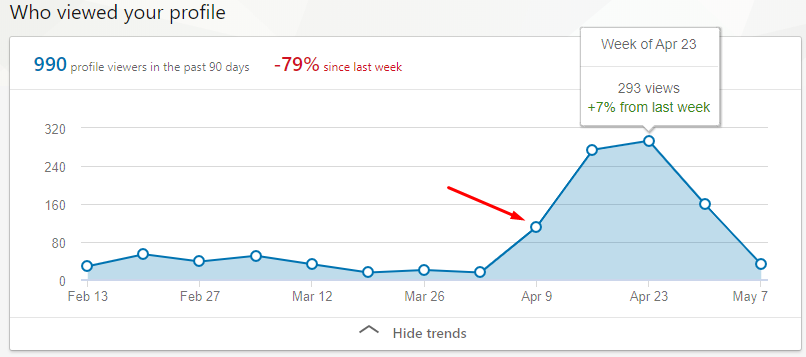
To do this properly, you would want to repost every day, using proper hashtags and build a bit of a following around it. I have also seen content like this being used to “hijack” other peoples posts who are getting tons of traffic and reposts. An effective growth hack, but takes a bit of time each day to truely scale. You could of course automate all this.
Recent Comments